Browsing 'Graphics': Posts from Game Design and Graphics
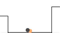
5SD064-Animation-bouncing balls
This week I have been working on the assignment for 2D1 course that the students were asked to animate a cannon ball and a rubber ball bouncing from a height and coming to a stop. After watching a short tutorial video, I started making my own bouncing ball by using the animation function in photoshop. There are four core principles when making animation in 2D space:
Solid, key drawing/pose = what happens
Timing = when it happens
Spacing = how it happens
Squash and stretch = the deformation […]

Student blog
This will be a blog where I post about the work I do in school every week and the reasons why I do what I do and the thoughs I have about it.
Have a nice time reading my blog!
Sofie Lindberg

Student blog
This will be a blog where I post about the work I do in school every week and the reasons why I do what I do and the thoughs I have about it.
Have a nice time reading my blog!
Sofie Lindberg
Conceptualizing the Behemoth
As a task for the second week, I were to start making our ”Behemoth” main character for our game. It was to be a large, towering Mech (in contrast with the large airship of the original concept document), and it was supposed to feel like it was much larger than anything else on the screen.
I started out with a rough silhouette sketch to estimate what kind of shape I wanted it to be, and the general shape I wanted it […]

What now?
Entry Journal 2018/02/08
During the past week, me and my group have worked on a game called Aetherial (concept designed by Team Vampire). A shoot’em up project loosely based on the Disney movie Treasure Planet and with some influences from the steampunk art style. At the first week’s sprint planning, I (as a graphic student) got assigned with figuring out how the player avatar was going to look like. Guess what this week’s entry journal is going to be about!
Aetherial takes place in a […]
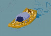
Development blog 1:Perspective in our game
Good morning all. As one of the artist in group Zombie. I am excited to announce the out newest game Umibozi. Before I start talking about every single feature in this game, I will be showing off the development of the design of perspective and the color in Umibozu.
The perspective in Umibozi was a real challenge for group Zombie to design. Umibozu is an exploration, adventure, top-down game that the player plays as a small fishing boat who want to […]

1. The Wasp enemy
We, Group Mimic, are making a shoot ’em up game for kids where you play as bees. One of the enemies is a wasp, and I was assigned to draw it.
As an enemy the wasp is quite annoying, following the player avatar around and shooting projectiles. So I wanted the wasp to look like an annoying character that takes joy in trying to ruin for others. One other important aspect was that the wasp should look different from the bees […]

Blog 1: Creating a color scheme
Hello!
My name is Petra and I am currently working on a shoot em up game called ‘Beelonging’. I am lead artist of the team and during the last week I’ve been working on making a color scheme for the characters in the game. The reason why I made a color scheme was to make it easier for the artists to share the colors while working on the same characters/background and also to see how the colors fit together.
Our game consists […]
Insight #1 – Setting the Scene
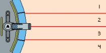
The original design document for Behemoth presented a simple yet challenging concept: “Feel like you are controlling heavy machinery”. This premise shaped how we approached the design and overall aesthetic of the game we are making, all the way from input controls to how the game looks and presents itself to the player. In this entry I will explain the thought process behind the layout of the game and what we try to convey with it.
One of the core elements […]
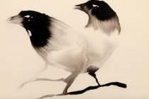
The Water of Umibōzu (pre-alpha state)
Our initial thoughts on the concept were that, due to it being based on a Japanese myth, playing should feel like an experience and like a journey. We want to keep the spiritual and mysterious (not everything is known) nature of the concept and build our game around that. What art style would suit the above best? It became clear pretty early that a more stylistic approach rather than a realistic one fits our concept best. Too detailed art draws […]
Hello!
Welcome! My name is Alexander Sinn and I am the Lead Artist on Team Cockatrice. We are currently developing a game based on the concept Umibōzu designed by Team Gnoll.
Umi.. what?
The spirit of the Umibōzu originates from Japanese folklore. It is said to be accompanied by strange ocean phenomenon. It has been described as a hostile spirit, destroying any ship that dares to cross its path. The few that have seen the Umibōzu are usually the sole survivors of the […]
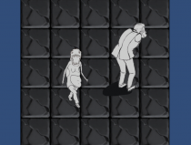
Background Study – Blog 1
Problems
This week, I have been creating the background tiles for the game. I tried to created highly realistic and detailed tiles at the beginning because I thought it would suit the “horror” game aesthetics well. The tile looked good without putting into the game scene. However, when I loaded it into Unity and tested it, problems occurred. A screenshot of the testing scene is shown below. There were mainly two problems. One was that the floor tiles were way to sharp […]