Browsing 'Graphics': Posts from Game Design and Graphics
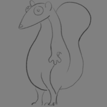
The Animation of Barry the Sqrrl
Have you ever wondered how cartoon characters seem to be alive? Well, of course you have and I am pretty sure you know how animators made it happen, but in case you don’t know how animators “give life” to your favorite characters, for example in 2D animation, they literally draw objects and characters on paper or in the computer and then position them in frames to create the animation.
There’s different kinds of animations like 2D or 3D, and different ways […]
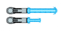
Insight #4 – Lasers & Animation
As explained in Insight #2 – Iteration, in our adaptation of the Behemoth game concept we decided on a military sci-fi setting with dystopian and cyberpunk elements through an arcade art style. Having this as our aesthetic cornerstone, we gravitated towards energy fields and lasers when we designed the visual representation of the ship’s dynamic elements; for example, we replaced the original explosive cannonball-like projectile with a powerful energy burst akin to that of an ‘energy attack’ as seen in […]

The Mist of Umibozu
One of the defining visual features of Umibozu is the mist, so it was important to discover a way to create a visually compelling asset that would surround the player for majority of the gameplay.
Throughout the development of Umibozu, I have returned to the subject of animating the mist with unsatisfying results a couple of times up until this week.
There were a few requirements I set for the mist design before producing it:
Concealment: The mist acts as a layer of concealment […]
Blog 4: Parallallallax
Hi!
In this entry I will write about the development of the background for our game Beelonging.
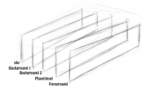
In our game you control a swarm of bees flying back to save the beehive from a hungry bear. It takes place in a forrest, so for our background we wanted to include trees, stones, bushes etc. Since our game is a side scroller, we wanted to have a parallax background, which means that you divide the background into several layers (background, player, foreground) and make them […]
Jellyfish on the Move
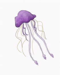
This week I would like to talk about the design and animation process of our second enemy, the jellyfish.
The enemy jellyfish has normal movement speed, low damage and has melee attack. It also latches onto the player avatar and slows it. I liked the idea of a jellyfish gliding in the sky because of its natural movement pattern. And thought the leg and tentacle movement would look aesthetic.
I started the design process by looking up several jellyfish types, and came […]
Comment #3: Carl Leong
https://carlgraphicscourse.wordpress.com/2018/02/22/the-scrumptious-parts-of-scrum/
Hi Carl!
Overall I liked your blog post describing the way the SCRUM method works for you and I generally share the same feelings regarding this subject. However, when referring to how the development method is based upon previous cycles I find it quite hard understanding the issue of not being able to work on specific goals until the sprint is completed. From my point of view the whole basis of Agile planning is to revisit some of the items, […]
Comment #2: Alexander Sinn
https://shirovfx.wordpress.com/2018/02/15/creating-an-unfogettable-ambient/
Hallo!
This blog entry is very cool! The way you describe what you are doing is both a narrative and a technical description, which is very pleasant and enjoyable to read. You describe very nicely each step that leads to the final decision and seeing that you are not really content with the result (even though the fog looks pretty damn nice and it expresses a lot of feeling), but you are eager to improve in the future […]
Comment #1: Mikael Ferroukhi
https://gamedesignbugbear998722415.wordpress.com/2018/02/07/game-design-journal-1/
Bonsoir, monsieur!
I have really enjoyed reading this blog entry. The writing style is very concise, explanatory, and easy to understand, which I think makes your post accessible to a larger group of people, not necessarily just your group members or other Game Design students. You present a clear explanation of the process behind coming up with this idea, even though I would have liked to read more about the decision of using contrasting designs to express different […]
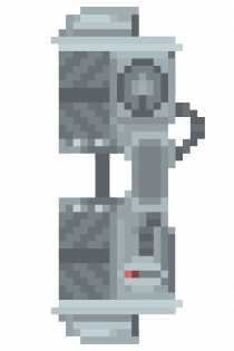
Entry #4: Creating the Spawner
Animation has turned out to be one of my favorite things to do. I am animating in pixel art which is, in some ways easier and in some ways harder than other formats of animation. With a limited ability to make exaggerated, accentuated movement, I must use the pixels I have with great care. On the other hand, the limited workspace also limits time consumption; there are only so many pixels to use, so a clear simplicity is preferred to subtle, […]
Comment #1
I really like the idea of the enemies having the same colour. It works well as an indicator. It’s not really explained why the colortone is what it is except for the “things that pop into my mind”, but I don’t think it matters as long as you find a color scheme you stick to. I also like how it’s clearly stated in the text that the game design choices affected the character design with the wing flapping.
You could be […]
Comment #2
Wow! This was a blast reading! I find it really interesting how you use an actual street as reference – although I’m unsure how you ended up with a random street in Denmark. I also think that using a lot of layers in the parallax is a good way to make sure it feels like a background rather than something the player could interact with.
The only thing I feel like I’m missing would be something that shows what how big […]
Comment #3
Hey!
Good thing to hear it seems like you’re moving towards a better workflow. I think a lot of motivation and self discipline is needed to work hard without anyone being there watching over you. I really like how you said you’re able to consult the team members if something is up, I think that’s a big part of doing work on a daily basis.
Although, as I think is mentioned in the comment above as well, I would love to know […]