A blog: Part 5 – The Final One
|
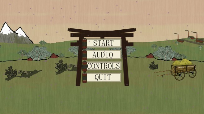
This week has been one of polishing, and UI creation for us that do the graphics in team Dragon. With the project getting extremely close to its deadline, we have enacted a feature freeze within the project. We will not be adding anything new but rather focus on balancing and polishing what we have, this means that we have time to work on the art that has been lacking the most: the main menu and UI. One of the most pressing items of feedback, that we received during playtesting and our beta presentation was the lack of feedback that we provide the player with. Players would easily get confused and not understand what to do to combat the demons for instance, so we decided that it would be best to look at ways of informing the player while in game.
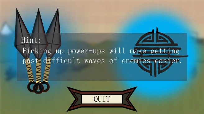
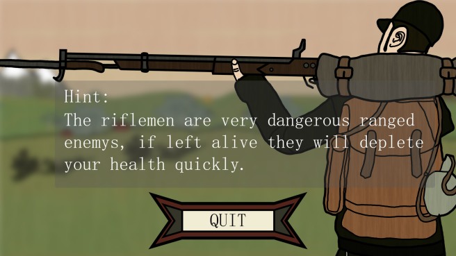
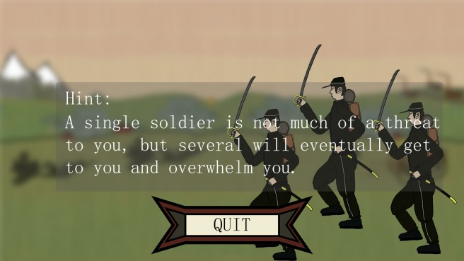
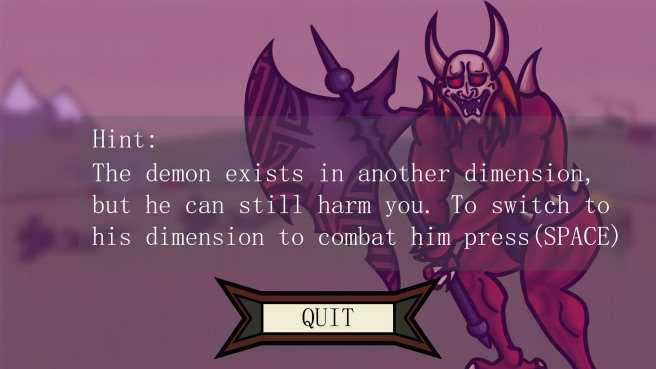
The first and simplest matter to attend to was to tell the player what they needed to do, as such this icon above will roll itself out and inform the player that they need to go right to progress. It is accompanied at the start of the game with a picture of the controls, that also disappears after a while. But not only that, i came up with the idea of using the game over screen as an informing element for the player aswell.
Which i think turned out to be a pretty good idea, it is difficult to fit this information anywhere else and we can just randomize which background image and hint text will be shown each time. To provide this sort of feedback to the player, which isn’t only just some text somewhere but also contains imagery. And to do it in a screen that the player will see, is invaluable. It is a well known fact that if the player doesn’t feel that they are provided information, or understanding why they failed a task, they will have a negative reaction. Games like Dark Souls tend to not explain that much within the game like what a boss is weak to, part of the frustration that players can feel is due in part to that. While tutorials nowadays can be far too intrusive, there needs to be a balance that can be struck here. In our case we want the player to receive the information in part through play, and to understand their failures when they do fail. The demon hint is the best example of this, as if you are killed by the demon and you didnt know how to realm shift this will provide you with that explanation. |
