Author Archives: Kasper Göransson
Week 8
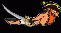
This week i have recolored and shaded various assets in the game, to make the game feel more consistent. This was before the makeover of captain Skip Legday:
At this point we had no light, no shading and only local colors.
This is after the recoloring:
The line art and animation was done by Kevin Alonso, but i took myself the freedom to remake the beard, making it look more affected by gravity. I also discovered, as i was uploading these gifs, that there is quite a lot of disturbance in the background that needs […]
Week 7
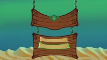
This week i have worked on the animation of the mermaid enemy, but i have worked on the menu as well, and that is what i will be covering in this weeks blog. This was the result:
Before i go into detail, here is a quick overview over my work and thoughts:
The background is intentionally taken from the game to reveals what the game will be like. I made the menu out of wood, with planks that are closely associated to […]

Week 5
This week we have focused on making tiles, reusable assets. We figured out that instead of making huge chunks of art, we could draw individual reusable objects. These ”tiles” feels a bit more static but gives us new advantages:
It’s easier to build smart level design when you don’t need to make an entirely new painting every time you come up with something. The level designers can put a level together like Legos.
You can put a lot more detail and precision […]
Week 4
This week i have been working further on the background, which is now three times as long. I have also reworked the colors that felt a bit too ”dirty” and did not drive the focus towards the player avatar enough, which the new colors does a lot better. The new line art helps with that as well, i have med it much thinner since my previous blog post. I added a diffuse filter to the background in Photoshop in order […]
Week 3
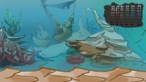
This week i have worked on the background of group 19s assigned game ”Mermaid River”.
One thing i kept in mind from the very start was to make sure the colors didn’t take up too much attention and that the line art wasn’t too sharp since i want the focus to be aimed at the character, the enemies and other things related to the actual gameplay. I really had to be careful with that particular part because it’s not always easy […]