Author Archives: Ida Lahti
3D Computer Graphics I: Week 2
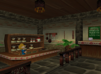
This week we worked with different visual styles and tried to make our own props while following one of these styles. I have chosen to look at the Cartoon, Sci-Fi and Post-Apocalyptic styles.
Cartoon
Cartoon style games are mainly focusing on portraying a simplified caricatured version of reality. The visual style of cartoony games is dominated by basic, slightly irregular shapes and vibrant colors. These games are also for the most part high key which feels natural due to all the colors. […]

Board Game Analysis: Pandemic
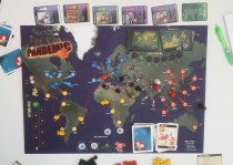
Pandemic is a cooperative board game where between two to four players take on the challenge to cure the world from infection before it spreads all across the world.
Win condition: Discover all four cures in time.
Lose states (any of these will on its own end the game)
All cubes of one color are on the game board at the same time
8 outbreaks in total
No more player cards left to draw
Gameplay Basics
In order to win the game, the players have to travel […]
3D Computer Graphics I: Week 1
Theory
Screenshot 1: The Evil Within
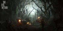
There are a lot of diagonal lines in this picture that don’t relate to each other to create an organic, cluttered look. It’s applied both to the foliage as well as the human structures. There is little negative space in the picture as the trees cover up a majority of the sky, reaching over the path like an arch. The high contrast in value on the sky and the silhouette from the trees puts the hanging […]

3D Computer Graphics – Theory and Application I: Week 1
The first week of the 3D course was focused mainly around the elements of art and how these are applied in context of digital games. We started with analyzing promotional images and screenshots from other games. Below is a brief analysis of the screenshots my group was given (Group A).
Screenshot 1: The Evil Within
There are a lot of diagonal lines in this picture that don’t relate to each other to create an organic, cluttered look. It’s applied both to the […]
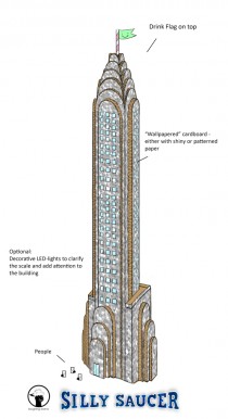
Megabuilding Concept Art
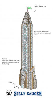
Concept art for the key landmark of the paper city. It will be the highest building placed in the very center. This is only a concept sketch, though, and might look different later in the game. It mostly resembles the Chrysler Building in NYC, because I liked how the texture of the cardboard would show on the layers edges.

Silly Saucer Banner
Here is the banner for my groups newest project, Silly Saucer. Ludwig has done all the the objects in the picture and I’ve done the touch up with composition, font and effects. I made the beginner mistake to work in a much too low resolution – I misunderstood the directions and read “pixels” instead of “millimeters”. The last hour before turn in I had to redo most of the picture and some effects got lost in the process due to […]
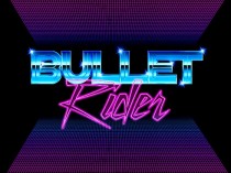
Project Terminal – Game Logo
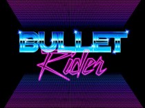
I got the honor to design the game logotype for the game menu screen. One might think that it is a quick thing to make, but like most assets it’s as challenging as you choose to make of it. I’d say that designing text actually is one of the more challenging things I’ve gotten to do since the letters have to read easily. I made three different designs before we got one that felt right.
After a while of pondering I […]