Author Archives: Camilla von Paykull
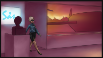
Friday's Work
I finished colouring my last frames for the intro of “Terminal” today, since I had all values done and a colour scheme to follow it went rather quickly. I managed to finish the one I started yesterday and the last three ones, now all that is left is figuring out how it should be presented.

Death
Last week I finally finished the death animation for the main character in “Terminal”, this turned out to be quite a challenge. I found it very difficult imagining how one would fall when dying and I did some sketches of how she might look when lying on the floor. I thought about googleing “dead girl” but I was afraid of what I would see so I just had to use my imagination.
I had one “death pose” that I liked although […]
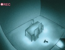
Intro
I have been very busy lately working on a comic book page styled intro for our game “Terminal” and I thought I should give you an update of what I have been doing.
As we had a storyboard assignment for the 2D course last week I thought I could kill two birds with one stone, since it was practically the same thing that I needed to do for this project. I reworked and added to a very basic storyboard that I […]
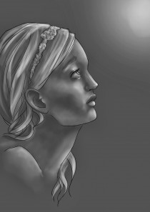
Friday Speed Paint
This is something I painted in about an hour and a half to practice rendering in grey scale and increasing my work speed, not getting caught up in details. I started with a rough sketch that I cleaned up into line art. I started rendering with a dark background, adding light where needed and blending it with the smudge tool. For the finishing touches I added some extra highlights and I thought about colouring it, but I like it better […]
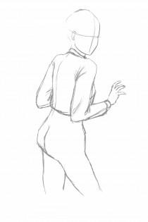
Ms X 2.0
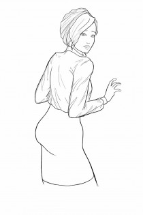
This week I have completed my drawing of Ms X that I posted here a short while ago and I thought I would show you a little more about how I worked.
I had an idea of the pose I wanted, so the first thing I did was searching Google for references of women looking over their shoulder. I found one that had an angle I liked and to save me some time I moved her body and arms to […]
Fly City 2.0
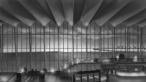
I have just finished the drawing of Ms X and the colouring of Fly City which will be the background of the main menu of “Terminal” and I thought I would just show you how it turned out. First a little recap of what it used to look like.
Here it is complete with colour and Ms X.
The colours I have picked from our mood board, trying to incorporate […]
Ms X
Yesterday I started on the first real depiction of our main character, known only as Ms X, which is to go on the main menu. I started with a rough sketch which I have reworked into clean line art, aiming at the style of the Ms Marvel comic, with thin line art that is thicker on the edges. I chose the pose and facial expression since I wanted to capture the essence of the game in the main menu. She […]
Terminal: Fly City
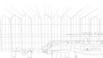
After the Alpha we felt that we really wanted to have a main menu for the Beta presentation and moved it up on our priority list. I started right away with doing some really fast sketches, trying to explore different ideas and layouts. Some ideas that we had did not fit the game we are creating, for instance, we had an idea of the interrogation room where the game starts, with a flickering lamp. This put on paper looked […]

Gender Equality in the Game Industry
Gender equality is a very hot topic at the moment and the game development industry is no exception, one of the most discussed topics is the case of the female armor. Very often you see in games that male characters are depicted in full armor, looking strong and masculine while the female characters are given armor that barely covers anything; basically she is going into battle in a metal bikini.
Example of Female Armor […]

Being shot
This week I have, among many other things, worked on an animation of the main character being shot. It turned out to be a rather tricky thing, I tried to imagine how the body would react if being hit by a bullet and tried to sketch it really fast. I experimented with movement in her arms, making them go up in front of her body but it did not look good at all and I soon realized that I should […]

Colour
Today we have studied light and colour theory, going through how light behaves and determines the colours. To study this we got to look at a lot of photographs of different environments, lighting and surfaces. This as well as getting to see an amazing artist create beautiful scenes and landscapes super fast was really interesting and I was inspired to try it for myself. After waiting all day we finally got to the practical part where we were asked to […]
Speed Painting
Today we had a lecture with Felicia about values and a little bit about Photoshop. We looked a little bit at different brushes and brush settings and experimented with using brushes in color dodge and linear dodge mode. We also looked at some short films showing the difference in hue, saturation and value and how you can create environments really fast in gray scale using foreground, middle ground and background.After lunch we got to do some exercises using what we […]