Author Archives: Marcus Litholm
Build orders and Starvation
We have Switched around some thing in the UI and added a build order to make sure that players build what we want them to. At least to some extent, we want players to build buildings vital to their progression in an as linear fashion as possible to make sure that players experience what we want them to when we want them to.
Doing this in an open ended, RTS game has proven difficult as we both want to give players that […]
Feedback and Feedback
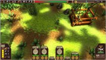
These past weeks we’ve conducted some playtesting sessions. We had put a lot of focus on our core mechanics. Those being our combat and gathering systems. We also had a lot of graphical assets in the game, with our game as it was we felt that we could test our core.
A lot of the feedback we got were focused on the lack of feedback in the game. There wasn’t any audio and very little visual feedback in the game at […]
Designing mechanics
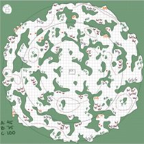
The past week I’ve been concentrating on discussing and reworking our games mechanics as well as building a level for our game.
This is what I’ve been creating, while it might look daunting at first it has a meaning. The green parts are filler woods that block settler movement. Each letter on the map is color coded and represents on of our resources. The green F is for the food resource, brown W’s are for the wood resource, the grey S […]
Designing UI
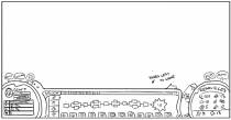
This last week I’ve been working on our games UI layout and design. This has proven to be a real challenge. While our game isn’t a true real time strategy game it does have elements from one, this lead to there being a lot of information that need to be shown on screen. Below is a screenshot from our prototype.
This is the current layout. The left display features information about the currently selected settler. A portrait, health and hunger bar, […]
Design Decisions
My name is Marcus Litholm and I am currently Lead Designer for the game Project: Floating Islands, the game is a survival RTS game where the player will have to control settlers on two separate layers. One is above on an island where they can concentrate on base-building and refinement, the other is down below in a jungle where the player will focus on resource gathering and combat.
Throughout the first week I’ve been concentrating on designing different aspects of the […]
Touching up on the UI.
This week I took to finishing the task of changing the UI to better fit our control scheme and to make it feel more intuitive to use and look at. Our previous UI featured bars to help the player keep track of pickups, powerups, glowsticks and to notify the player when he or she carried to much or a heavy object, as well as a score counter. They were all aligned vertically on the left edge of the screen.
This was […]
Fixing a Level Design
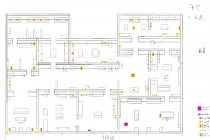
So I dedicated part of this week to restructuring our level design map. The initial map were only lines and thus it was really cluttered and hard to read. The point of the map is to provide the person who builds the map with the information necessary to do so. Everything need to be easy to read, easily discernible and provide a clear structure to follow when building it. The first draft I made failed to deliver on all of […]
Creating a UI for Fancy Mansion.
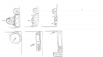
This week I took on the job of creating a UI for our game. The different aspects that our UI had to cover was a way to count and visually represent score or the goal, visual representation of an inventory for our powerups, a way to show the player how many glowsticks he or she had left. The last two things we needed to show was an inventory or counter for the carry limit and a way to show the […]
Even more animations
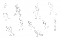
So lately I have been working on reworking some animations for our game Fancy Mansion. What I have been trying to do is to make our walking animation more comical to fit our style or eventually get the comical aspect down in some other animations. The hard part of this task is to exaggerate some aspects of the movement and to translate it to our pixelated style. So far I haven’t been able to transition this exaggerated movement in a […]
Objects and Tilesheets
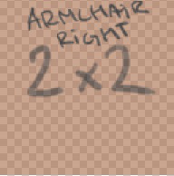
This week I worked on our teams collidable objects, or furniture. I worked on designing and organizing them into a larger tilesheet. We in Team 4 wanted our levels in Fancy Mansion to feel cluttered so in order to achieve that feel we needed a lot of furniture/objects and decorative items. The planning process began by listing all the objects in a list and counting them. Once I knew that much I designated a preliminary sizes. Each size was counted […]
Working on Otto’s animations.
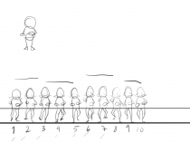
This post will be about how I went about creating the animations for Otto’s movement.
At first when I began drawing these animations we hadn’t had our lecture in animations yet, you could say that it was a frustrating and time consuming task at the time. I fumbled my way through frames and in the end I had about 30-40 frames for a simple walk cycle.
After the lecture on animation I had a breakthrough in my thinking around animation I learned […]
Some progress on Project SlashR
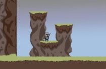
I sat down for a couple of hours and drew some more ground for the game, just to get something done. I covered the basic ground chunks and some platforms. They are drawn in such a way that you can move them around and build a landscape without too much of a hassle. I also drew a quick idea for the main character. I will now move on to draw some more ground and and decoration objects aswell as a few […]